Input to Advertising work:
Leaflet (Final)
Katie - Outside of leafletMaia - Inside of leaflet
Postcard (Final)
Katie - Back of postcard (contact details)
Maia - Front of postcard (art work)
Poster (Final)
Katie - Initial idea and sketched out
Maia - Created on photoshop
Risk Assessment - Maia
Mind Map - Katie/Maia
Selecting Advertising Client - Katie/Maia
Client Research - Katie/Maia
Initial Brief - Katie/Maia
Research and Development - Maia
Rough Ideas - Katie/Maia
Sketches - Katie/Maia
Questionnaires - Katie/Maia
Invoices - Katie
A1 Poster - Katie/Maia
Quote - Katie/Maia
Tuesday, 12 May 2015
Monday, 11 May 2015
Quote
- plan to have a video of a guy in a taco suit - go viral - multi-media platform
.jpg) |
| Outside of leaflet |
.jpg) |
| Inside of leaflet |
THE LEAFLET
Aims and Objectives:
Our aim for this leaflet was to inform potential new customers about Nanna Mexico's brand and what they offer, to show they are unique to their competitors. As well as introduce the target audience to the type of company they are: fast food, high quality chain which can compete with brands such as Subway and McDonald's.
Timescales:
- Final proofs to be checked by marketing manager and managing director of Nanna Mexico - June 1st
- Corrections and final proof for printer - June 8th
- Print run returned by June 21st
- Leaflets to be distributed during the Summer months of July and August, where there will be a higher number of tourists and passers-by during this peak time, especially as the weather will be hotter so more people will be out and about, and students will have finished school so they will be in the city centre more often. As a result of this, the passing trade will be higher and will correlate with the increased footfall.
- As for the time of day, the leaflets will be handed out during the lunch hours of 12pm and 2pm. This is because it is expected to be the busiest time of the day as it's lunchtime and is the average time where shoppers want to look for somewhere to eat.
Resources and Equipment:
- The main resource we need is a supplier to print high-quality copies of our leaflets, quickly and efficiently.
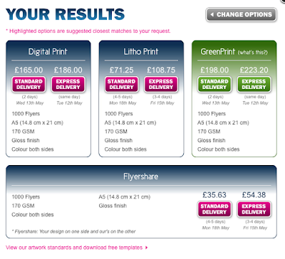
- When thinking about the costing of printing the leaflets, we looked at stuprint.com to print our products, as they would us print high-quality, low cost leaflets.
Budget:
- We were given no specific budget, however we wanted to try and keep our costs as low as possible. Our leaflets were printed in A5, and we got a quote from stuprint.com to give us an idea of the prices we were looking at.
Legal and Ethical Issues:
- We were given a branding booklet by Luis which clearly outlined the specific guidelines we had to stick to when creating our products. It showed us everything from the colours that had to be used that matched the house style (all coded so they would be the exact same colours), to the measurements of how far away the logo can be placed by the edge of the paper.
- One legal issue we could have is the use of the Google Map on the back of the leaflet, as we have not got permission from Google ourselves to use it, however we took the image of the map from Luis' website so it would all depend on whether he had gotten permission himself.
- Google have some guidelines about using maps in print here: http://www.google.com/permissions/geoguidelines.html#maps-print which states that we can use Google Maps images in our print products as long as we do not make any changes to the map, for example deleting, blurring, or adding clouds to the image.
Personnel and Activities:
- Between myself and Katie, we both contributed evenly towards the ideas for the leaflet
- We both pitched our own original ideas to each other and then combined the best elements from each to create a final draft
- We decided we would divide up the work equally - one of us would design the inside of the leaflet, and the other would design the outside. As a result, I (Maia) created the outside and Katie designed the inside of the leaflet.
 |
| Front and back of postcard |
THE POSTCARD
Aims and Objectives:
The aim of this postcard is to inform potential customers of the location, opening times and contact details of Nanna Mexico. We wanted to create a smaller product that could be more convenient to give to customers when they are rushing around shopping, and we used bright colours to make sure it stood out and caught their attention when they were given it. We think that this would lead to more customers checking out the restaurant.
Timescales:
- Final proofs to be checked by marketing manager and managing director of Nanna Mexico - June 1st
- Corrections and final proof for printer - June 8th
- Print run returned by June 21st
- The time of year this product would be distributed would be around Spring, so April to May. The reason it would be this time of year is because the weather will be beginning to get warmer and there will be more people coming into the city, making it a popular time for tourists and passers-by
- The resources we would need is a supplier to print copies of our postcards to a high quality standard
- When creating initial ideas of the costings, we looked at a company stuprint.com, this company had reasonable pricing along with good quality prints
- We have no specified budget, however our aim is to keep costs as low as we can.
- Here is a quote from stuprint:

Legal and Ethical Issues:
- As we was given a branding booklet which included everything we could and could not use for the postcards, this helped us establish what was appropriate to use so it still fits with the house style. The booklet contained colour codes which could be used, along with imagery and text fonts.
- A legal issues which could be a problem is the google maps image which we put on the the back of the postcard however we took this image off the Nanna Mexico website, this means it depends on whether Luis got permission to use it. Here is the terms of use for google maps. http://www.google.com/permissions/geoguidelines.html#maps-print this states that we are eligible to use it on a print product as long as we do not make any changes to the map for example deleting, blurring or adding clouds to the images.
Personnel and Activities:
- Between myself and Katie, we both contributed evenly towards the ideas for the postcard.
- We both pitched our own original ideas to each other and then combined the best elements from each to create a final draft.
- We decided that to divide up work equally, one of us would design one side of the postcard, and the other would design the other side. As a result, Katie made the back of the postcard with all the contact details and I created the art on the front of the postcard.
 |
| Poster |
Aims and Objectives:
- The aim of this Poster was to create a simplistic yet eye catching product that linked with the rest of the house style and would be appropriate to display in the restaurant window. The objective is to attract customers.
Timescales:
- This product would be displayed all year round in the restaurant until the branding was to be updated, for example.
Resources and Equipment:
- The resources we would need is a supplier to print copies of our poster to a high quality standard.
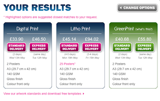
- When creating initial ideas of the costings, we looked at a company stuprint.com, this company had reasonable pricing along with good quality prints.
- We have no specified budget, however our aim is to keep costs as low as we can.
- Here is a quote from stuprint:

Legal and Ethical Issues:
- As we was given a branding booklet which included everything we could and could not use for the postcards, this helped us establish what was appropriate to use so it still fits with the house style. The booklet contained colour codes which could be used, along with imagery and text fonts.
- To create this poster, Katie created this idea and sketched it out for myself to then make on Photoshop.
Subscribe to:
Comments (Atom)


